

Percentage of Mark Up and Mark Down with prices
In this blog I break down finding percentage of Mark Ups and Mark Downs. The following is a short excerpt from my book the Ultimate Percentage Guide.


Get the Ultimate Guide to Percentages!!
This book is all about percentages (No shock there). It is divided into two parts: Percentage Guide and 30 Printable Percentage Puzzles/Games/Activities. The Guide portion of the book has notes and examples of different situations involving percentages (such as the modeling section above). There is a premium on using an algebraic approach to solving problems in this guide, but different methods are also used.
The following are the sections of this guide: Percentage History Percentage, Fraction, & Decimal Conversion Modeling Percentages Percentages as Ratios Finding the Percentage, Part or Whole amounts Comparing amounts Percentage of Change Percentage of Markup Percentages with Tax and Tips Percentage of Error Simple and Compound Interest Commissions
The Games/Activities/Puzzles section of the book is a combination of 30 different printable puzzles, games and activities. These are all puzzles that I have used with my classes. They are great for station work or just to supplement a percentage lesson

Percentages: Comparing two amounts
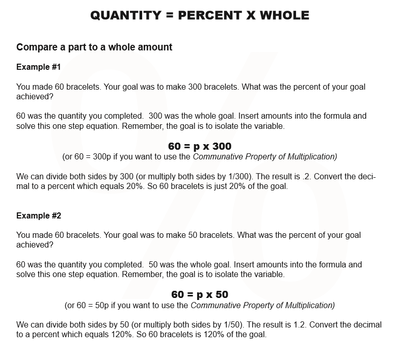
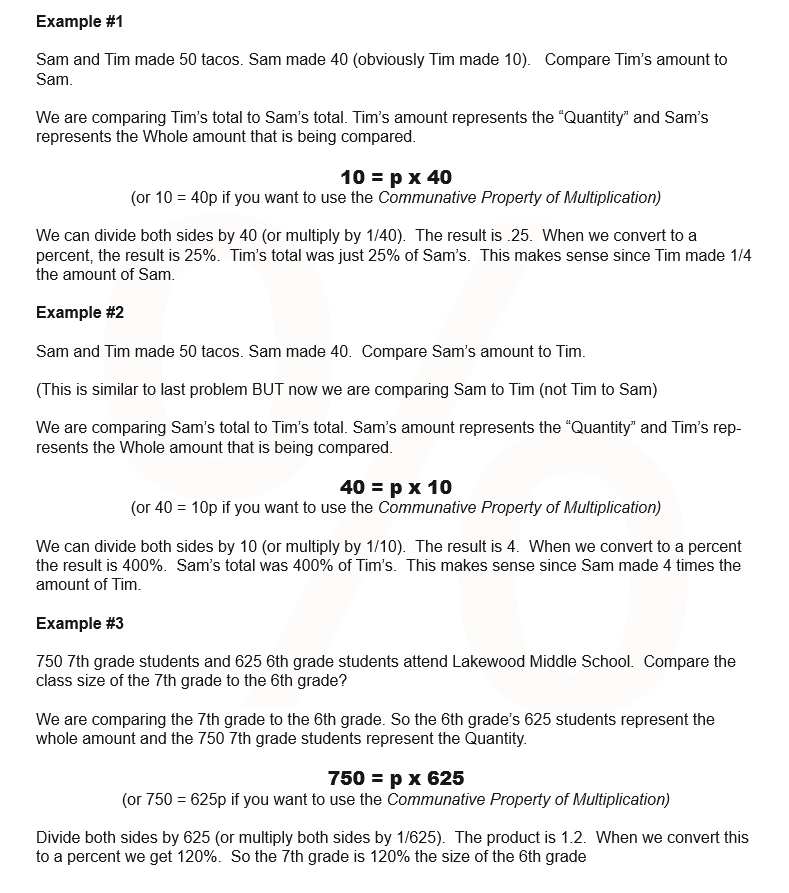
Comparing Quantities using Percentages
In this section, we are going to be comparing Quantities. The formula we use is very similar to part = percent x whole, but with a small tweak. Instead of “part” we are using “Quantity.”

This is a short blog to show how we find the percentage when comparing two amounts. The formula we use is very similar to part = percent x whole, but with a small tweak. Instead of “part” we are using “Quantity.”
Get the Ultimate Guide to Percentages!!
This book is all about percentages (No shock there). It is divided into two parts: Percentage Guide and 30 Printable Percentage Puzzles/Games/Activities. The Guide portion of the book has notes and examples of different situations involving percentages (such as the modeling section above). There is a premium on using an algebraic approach to solving problems in this guide, but different methods are also used.
The following are the sections of this guide: Percentage History Percentage, Fraction, & Decimal Conversion Modeling Percentages Percentages as Ratios Finding the Percentage, Part or Whole amounts Comparing amounts Percentage of Change Percentage of Markup Percentages with Tax and Tips Percentage of Error Simple and Compound Interest Commissions
The Games/Activities/Puzzles section of the book is a combination of 30 different printable puzzles, games and activities. These are all puzzles that I have used with my classes. They are great for station work or just to supplement a percentage lesson.

Percentages: How to find the Percent, Part and Whole Amount
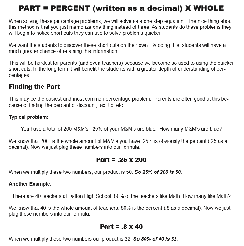
When solving these percentage problems, we will solve as a one step equation. The nice thing about this method is that you just memorize one thing instead of three. As students do these problems they will begin to notice short cuts they can use to solve problems quicker.
We want the students to discover these short cuts on their own. By doing this, students will have a much greater chance of retaining this information.
This will be hardest for parents (and even teachers) because we become so used to using the quicker short cuts. In the long term it will benefit the students with a greater depth of understanding of percentages
Get the Ultimate Guide to Percentages!!
This book is all about percentages (No shock there). It is divided into two parts: Percentage Guide and 30 Printable Percentage Puzzles/Games/Activities. The Guide portion of the book has notes and examples of different situations involving percentages (such as the modeling section above). There is a premium on using an algebraic approach to solving problems in this guide, but different methods are also used.
The following are the sections of this guide: Percentage History Percentage, Fraction, & Decimal Conversion Modeling Percentages Percentages as Ratios Finding the Percentage, Part or Whole amounts Comparing amounts Percentage of Change Percentage of Markup Percentages with Tax and Tips Percentage of Error Simple and Compound Interest Commissions
The Games/Activities/Puzzles section of the book is a combination of 30 different printable puzzles, games and activities. These are all puzzles that I have used with my classes. They are great for station work or just to supplement a percentage lesson.

How I'm starting the school Year.
I used to open up the school year with some nice get to know you activities. For example, I might randomly partner students together and have them interview each other. After the students asked each other a few questions, they would introduce their partner to the rest of the class. This was always a nice way to ease into the school year and get to learn a bit about the kids.
As much as I (and the kids) enjoyed these opening day activities I always felt something was lacking. There seemed to be this disconnect with these activities and math. (Also, it seemed like every teacher in the building was doing some variation of this. So the students were doing this all day long. The novelty was lost by the time many got to me.)
Last year I tweaked how opened the school year.
I would still do surveys, but with a more organized purpose. I would make up the surveys with the end goal of the students graphing the results of their surveys.
Normally graphs/charts get shoved to the end of the year (sometimes it gets totally left behind because of snow days). This is such a bummer because there are so many activities during the year that are conducive for using, reading, & analyzing graphs. For example, this year I am planning on a year long Stock Market lesson. Needless to say, graphs are sort of a big deal in this world.
The following are a few of the advantages of opening the school year with this survey/graphing lesson:
- You would get to learn about the students as a group/class/grade level.
- While students are creating graphs you have the opportunity to interact 1-on-1 with different students which helps to get to know the student.
- Lots of hands on activities.
- It's not a stressful environment.
- Students would be able to move around instead of stuck in their seat the whole period.
- Students would be able to interact with other students.
- Students would have freedom to be creative.
- Students get to collaborate with each other
- As a teacher you get to cover 7 different graphs (bar, line, circle, scatter, stem-n-leaf, histogram, box-n-whisker), median, coordinates, angles, intervals, number lines, & degrees of a circle.
- Reading and analyzing graphs.
- You get to cover an area that many times doesn't get covered, or gets just minimal coverage.
- You can use graphs with a variety of units (graphing equations/inequalities for example) during the year.
Below are the steps I took:
STEP 1 - The Survey
The first thing I did was to create a survey. When creating questions I focused on questions that I could use to create different types of graphs and different ways to group students.
(QUESTIONS: gender, class period, how much do you like math (scale of 1-10), how good are you at math (scale of 1-10), grades at Lakewood (k,1,2,3,4,5,6), In the band, sports played, social media, Height, and arm span).
For example, Line Graphs are a bit of a challenge because of the time element needed. To get around this I asked the students to circle the different years they attended our school. This would give us the element of time (grades k-6) that we could use on the x-axis.
Two of the questions (gender & class period) would allow students different ways to group the information.
STEP 2 - Gather and Sort data
Next, students would need to tally up the results of these different survey questions. At times I will let the students figure out how to gather and organize the results. Usually this is chaos. Sometimes chaos is good, but with most students this just leads to anarchy. As a result, I will usually guide/teach students how we can group and record the results of the surveys.
I make sure that the data is split between boys and girls. Because each class is looking at their results, the data is already divided by class period.
STEP 3 - Bar Graph
I like to start with bar graphs because they are the easiest and are the ones the students have been using these for years. This is the sequence I follow when working with bar graphs:
- Lesson on bar graphs
- Parts (x & y axis, title, labeling x & y axis, intervals of y axis, and categories of x axis)
- How bar graphs can be deceptive (using different intervals and skipping intervals)
- Different ways to design bar graphs (double bar graphs, stacking bar graphs, vertical vs. horizontal)
- Reading Bar graphs - I will create a power point with a couple of bar graphs. I will show these graphs to the class and ask them what information they know from looking at this graph.
- Make a couple of basic bar graphs as a class (ex. I might make up info about number of dogs and cats in each class ) period. I show students different ways to group data (by class, gender/class, all students, all students broken down by gender, etc.).
- Finally students can make a bar graph of student gender and/or band participation.
STEP 4 - Circle Graph
The next graph I like to use is the circle graph (aka the Pie Chart). Most students are familiar with reading this graph but are weak at making it. In younger grades, students usually will estimate the parts of a circle graph.
The number one struggle for many students is not the math (it's still a struggle), but actually the act of making a circle with a compass. I also opt for the Angle Ruler instead of the Protractor.
- Lesson on circle graphs
- circles are 360 degrees
- Converting the numbers in a survey to degrees in a circle graph.
- I teach 360 divided by number of responses in a survey = degrees of each response. I will show students different ways to round numbers and their impact on the graph.
- How to use the Compass
- How to use the Angle Ruler (to measure and create parts of the circle graph)
- Reading circle graphs -Just like with bar graphs - I will put a couple samples on a power point and share with the class. Together we will discuss what we know about this graph.
- Make a couple of basic circle graphs. For the examples I always (at least at first) use numbers that are multiples of 360 such as 180, 120, 90 etc.
- Finally students can make a circle graph of different sports that students are in. (boys only, girls only, boys/girls combined etc.)
STEP 5 - The Box-and-Whisker Graph
For most of my 7th grade students this is a new thing. It's got a goofy name (I just assume some lady that loves cats named this thing) and it looks a bit strange. Sometimes kids can be a bit apprehensive because of how it looks. I spend a bit more time on examples of the Box-n-whisker just because it is new and has has a lot of different parts.
- Lesson on Box-and-whisker graphs
- Parts of the Box-and-Whisker
- Extremes, Quartiles, median, number line, box, whiskers
- The four parts of Box-and-Whisker that are each 25%.
- Parts of the Box-and-Whisker
- Reading Box-and-Whisker graphs -I usually start with a double Box-and-Whisker Graph sample. For example, I usually will have two "random" classes and their quiz scores. The first teacher (Mr. Smith for example) I will make sure his extremes are both larger than the other teacher's extremes (let's call her Mrs. Jones). I will make the quartiles and median for Mrs. Jones larger than Mr. Smith's. Actually I line up Mrs. Jones' median with Mr. Smith's Upper Quartile and her Lower Quartile with his Median. This leads nicely to a discussion about which class did better on the quiz. You can make an argument for each class.
- Next I have the students make different box-and-whisker graphs. To make a Box-and-Whisker you are finding three Medians: Whole, smallest half and largest half. There are four different situations that occur:
- Total is an odd amount of numbers and halves are odd an amount of numbers
- Total is an odd amount of numbers and halves are an even amount of numbers
- Total is an even amount of numbers and halves are an odd amount of numbers
- Total is an even amount of numbers and halves are an even amount of numbers
- Finally, students can make a Box-and Whisker Graph of the total number of students that are good at math. ***Make sure that the extremes, quartiles and medium are five different numbers***. If you do have duplicate numbers you will want to look at either "students that like math," "student heights," or "student arm spans."
STEP 6 - Line Graph
Line graphs are another graph that students have used. A key focus is the element of time (minutes, days, weeks, years) on the x axis. The biggest mistakes I are usually intervals not being consistent (x and y axis) and when plotting points, not using the grid lines to help plot the points.
- Lesson on Line graphs
- Parts (x & y axis, title, labeling x & y axis, intervals of x and y axis, and some element of time on the x axis)
- Having consistent intervals on x and y axis
- Showing how to correctly plot the points on line graph.
- Show how bar graphs can be deceptive. For example, the greater the intervals on the y axis the smaller the bars (the smaller the intervals the greater the size of the bars.)
- Reading Line graphs - I will create a power point with a couple of line graphs. I almost always use a graph of a companies stock price over the years (I look for a company with a lot of price swings and that the kids like.) I will also introduce double line graphs which compare two different items (such as two different companies).
- Next, I'll have students complete a couple of easy line graphs (usually multiples of 5 or 10)
- Finally, I will have the kids make line graphs of the number of students attending Lakewood over the past 7 years. If I want, I can make a line representing each of the classes, boys and girls or my students vs. the other math teachers students.
STEP 7 - Histogram
Histograms look a lot like bar graphs. Most people would just assume they are same. In my 7th grade classes, very few of my students have ever heard of a histogram. The biggest difference between a bar graph and a histogram is the x axis. The bar graph will show categories (like types of colors, favorite pets etc.) while the histogram will show a sequence.
- Lesson on Histogram
- Focus on how the Bar and Histogram are nearly the same with the exception of the x axis which the Histogram uses some type of a sequence (such as time, weight, ages).
- Parts
- x and y axis, intervals, labeling each axis, bars (bars - which must touch)
- Reading a histogram
- Reading a histogram in many ways is more like reading a line graph, especially if the sequence on the x axis is an element of time. Like the other graphs I will have a couple examples to look at.
- I usually just have one simple histogram for students to do before we work on the survey histogram.
- Students will make a histogram of the number of students attending Lakewood each year. (yes I know it's the same topic as with the line graph).
STEP 8 - Stem-n-Leaf Graph
The stem-n-leaf graph is really ideal for gathering and recording large amounts of data. The advantage of the graph is that you only need to record half the numbers. It also can be a nice graph to compare to amounts side by side.
- Lesson on Stem-N-Leaf
- Show students how the numbers drawn vertically represent the tens place. Only the number found in the ones place is written next to the vertical numbers. make sure numbers are written in numerical order (left to right on the right side of the stem and right to left if written on the left side).
- Parts of the Stem-n-leaf graph
- Stem, leaf (numbers written horizontally), a second stem if using a double stem-n-leaf and title
- Reading a Stem and leaf graph
- Reading a Stem-n-Leaf is very different from other graphs. A single Stem-n-leaf you read like a book - top down and left to right. In the case of a double steam-n-leaf graph you read the "leafs" on the left, top down, BUT right to left.
- I will do a couple (one single and one double) Stem-n-leaf graphs with the students using basic numbers. In addition, I will show how how to write numbers that are over 100.
- Students will make a a double Stem-n-leaf graph using the height and arm span of 7th grade students)
STEP 9 - Scatter Plot
Even though the Scatter Plot is not a required graph to teach it doesn't take long to teach and it's great at showing trends/patterns.
- Lesson on Scatter plots
- The biggest thing that is new for the scattered plot is reading coordinates (x,y). I really try to focus on having students use the vertical and horizontal lines when plotting points.
- Parts of Scatter Plot
- The set up of the scatter plot is similar to bar, line, or histogram.
- Reading Scatter Plot.
- The biggest thing is the relationship between the x and y axis.
- How to read - x first and then the y
- looking for trends/patterns
- When looking at the graph we are looking for a pattern for example...
- If you work more (x axis) the y axis (money) also increases.
- If you run more (x axis) your weight (y axis) will decrease.
- sometimes there is now trend (waffles you eat and your height)
- When looking at the graph we are looking for a pattern for example...
- The biggest thing is the relationship between the x and y axis.
- As with the other we will do a couple of basic examples
- Students will use their height and arm span to see if there is a correlation between their height and arm span. I will have one massive coordinate grid which all students will plot their coordinate.
- Next I will draw a line (not quite a fitted line) that connects all coordinates with the same Height and Arm Span. Students will discuss how their coordinates compare to the line (most are on or below). Finally, I will plot the coordinates of NBA players preparing fore the NBA draft. Students will notice how most (if not all) the players are located above the line. We will then discuss how this is an difference in height and arm span is a huge advantage for basketball.
At the very end of the lesson we have students brainstorm all the different things about their class that they can determine from reading the graphs. This is a nice chance to overlap with Language Arts. We put the results on a hallway bulletin board (it's big) to share with our fellow classmates.

Making 3D Shapes and Similar Objects using Scale Drawing
Creating 3 Dimensional Drawings
One of my favorite activities each year is using scale factor to create three dimensional drawings. We do this activity when we are studying Unit Rates. There are a variety of reasons why this is one of my go to lessons.
Hands On
This activity gives students the chance to create something. The act of drawing, measuring, & designing is a nice change of pace from the usual worksheet avalanche. The actual act of creating this object allows students to see the relationship of sides all changing proportionally.
Creativity
This lesson gives students the opportunity to showcase their creative/artistic side. We have some basic guidelines, but in general students are free to design what appeals to them.
Visual
Many students are visual learners. For some students it easy to see difference between an object drawn to scale and an object that does not have a constant proportionality.
Connections with other classes
Art, Social studies (maps), industrial tech, and computer science classes are some of the classes that we are able to show a connection with. For example, our art classes use one point perspective drawings which share a ton of similarities with our scale drawings.
Differentiate
The activity allows you to increase (or decrease) the difficulty. For example, if you have a student that is struggling you can use a very simple shape such as the letter "L" or use a very easy scale factor such as 2. If you want to increase the intensity you can have students measure everything in inches (not centimeters) or require a very unusual scale factor such as 3/8 or 1.75.
THE PROCESS
The Build Up
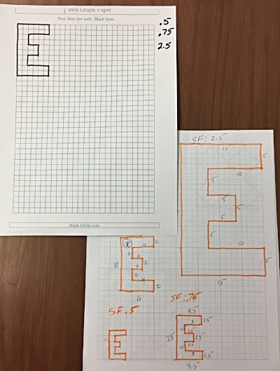
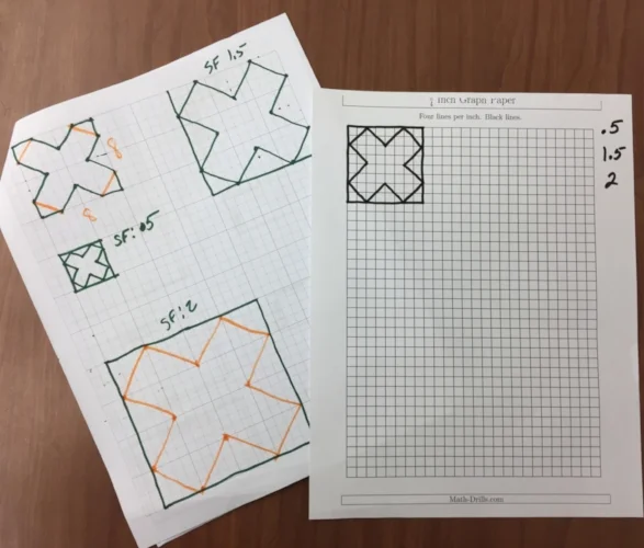
One of the first things we do is to talk about Scale Factor. We want the students to understand that when we are enlarging (or shrinking) an object all the edges of this object are increasing (or decreasing) at a constant rate (proportion). We do this by having a worksheet with similar objects and their measurements. Students will then find the rate of increase or decrease (Scale Factors less than one = smaller, greater than one = larger).
Next, we give the students a grid paper with a shape on it. We first start with a basic rectangle then move on to more complex shapes. Above are two of the sheets we used this year. We give the students a few different Scale Factors we would like them to use to create a similar object. You can see on the "E" paper on the left we used Scale Factors of 0.5, 0.75 & 2.5.
Usually after doing a few of these the students begin to understand how all the edges are increasing at the same rate.
Model the Process

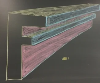
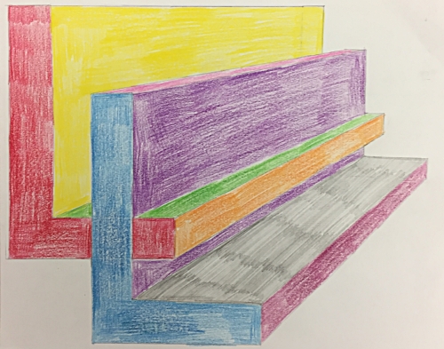
The first thing I like to do is to show them an example. I start by drawing a random object. In the example above (left) I used the letter "F." I like to use a letter with a lot of edges because it helps to show how all the different edges shrink (or enlarge) at a constant rate.
After I draw the original "F" I then draw a second letter "F" and connect all the corners. I like to have the students connect ALL the corners, even the ones that will be covered once we color. I have to students lightly draw their lines, but I like to see the lines after they have been colored over.
Next, I color in the different sides that would be visible. This is a real struggle for students to visualize. I try to color code my example to help the students to better visualize. In the example above right I use yellow for the tops, pink for the right side of the stem and blue for the right sides that stick out. (I realize this is not technical talk). The result is an object that has a three dimensional look.
Experiment with something Easy
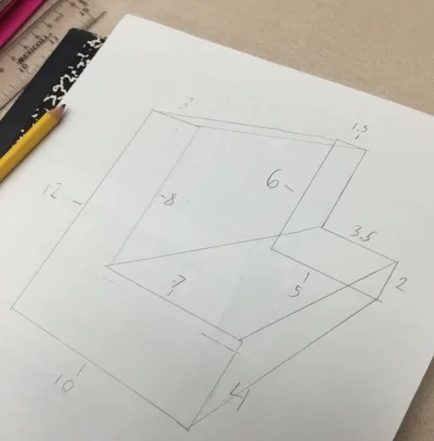
I like the students to start with a very simple shape, such as a rectangle, to get a feel for the process. One of the most common mistakes is for a student to get in over their head on their very first object. After getting some experience with a simple shape it is time to move on to a more complicated shape.
Making your 3D object
Once we feel like the students understand what we are trying to do we turn them loose.
Students select a shape that they like. (We have students stay away from rounded edges until we feel like they totally grasp the concept). The students will draw the original object and then a second similar object. We usually let the student pick their own scale factor (almost always 2 or 1/2), but at times we will select a scale factor when we want to challenge the students.
Once students have drawn these two similar shapes they connect the corresponding corners.
* As a side note: where you place the second similar object will change to look of your 3D object. This is a good thing to experiment with a basic shape.
Once the two shapes have been connected it is time to color. This is a great way to determine if students can visualize what sides can be seen and which ones are blocked or partially blocked. When coloring, it is helpful to use different colors to help each side stand out. Another thing to help the shape to really stand out is you trace over the visible edges with a pencil but to push down very hard to make darker lines.
Drawing a similar object using a scale factor
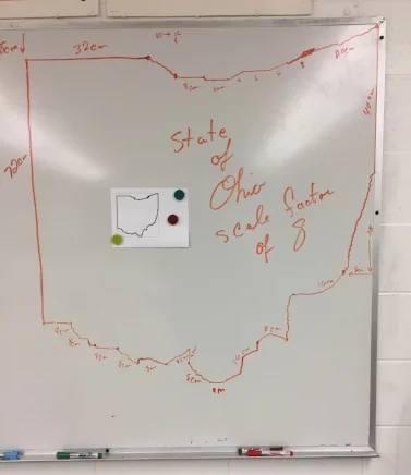
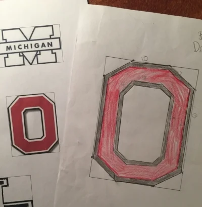
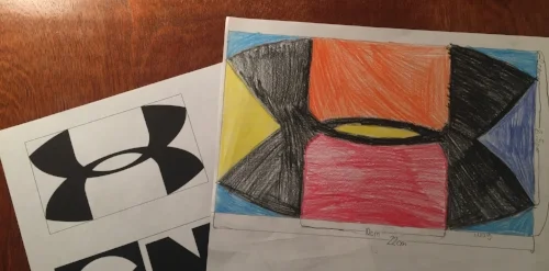
Another thing I like to do with scale factor is to have students draw an object to scale. We give students a packet of different shapes that they can select from. We have a collection of basic and challenging shapes to select from. One key thing we do to help the students is to to draw rectangles around the objects. Why? This gives the students something to help guide them.
In the example below, on the left we have a copy of the state of Ohio. Is my scale drawing of the picture of Ohio. On the original paper copy on the left the upper left corner is 1 cm below the corner of the rectangle. When I did the scale drawing of Ohio I used a scale factor of 8. As a result, I measured down 8 cm from the upper left corner of my rectangle.
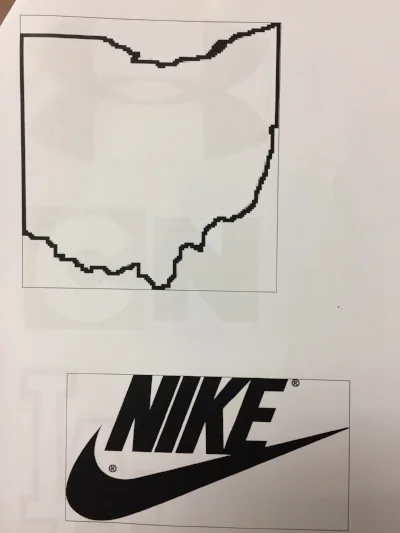
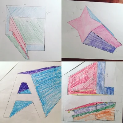
Below are a couple of examples of students drawing similar objects using a scale factor.
Todd Hawk is a middle school math teacher and the Founder of the Land of Math LLC (www.landofmath.com). You can reach him at landofmath2@gmail.com or follow him on twitter: @landofmath2 and Instagram: @landofmath
Creating a Successful Math Newsletter

One of the things we try to do each year is to create a math newsletter to share with parents, students and administration. The main reason is to help develop better communication with parents. The development of our newsletter is an ever evolving process, but we feel like we have hit on some key things that make our newsletter very effective.
At the start of the year we focus on gathering the email addresses of different parents, students and any one else that might want the newsletter. We have been able to get around 90% of our student's families to sign up. When we send out the newsletter we just email a PDF to the different people on our email list. We mail copies to families that did not sign up for email. We also make extra copies and leave in the classroom for students that might not see the email version. In the past we sent out newsletters each month. This year we are attempting to send out one a quarter.
Above is a sample of one of our newsletters. The rest of this article will focus on the content, features and structure of the newsletter.
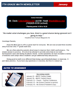
#1 Headline: The first thing we do on our newsletter is state what it is and for what time period. In this case we call the newsletter the "7th grade math newsletter" (yes we know, verrrrry creative). If we had newsletters for each individual teacher we might have use something like Mr. Mitchell's Math Class (also very boring) or perhaps something slightly more interesting such as Math Mania.
#2 Contact Information: This part of our newsletter includes information such as Names, email address, school phone, planning period times, website, etc.
#3 Quote: We like to have a quote about dealing with one of two topics: 1) Importance of math and/or 2) Motivational.
#4 Greeting: We address this to the parents despite the fact that many of the readers of the newsletter are our students.
#5 Dates to Know: Just like it sounds. We focus on big events such as early releases, no school, end of grading period, parent - teacher conferences, etc.
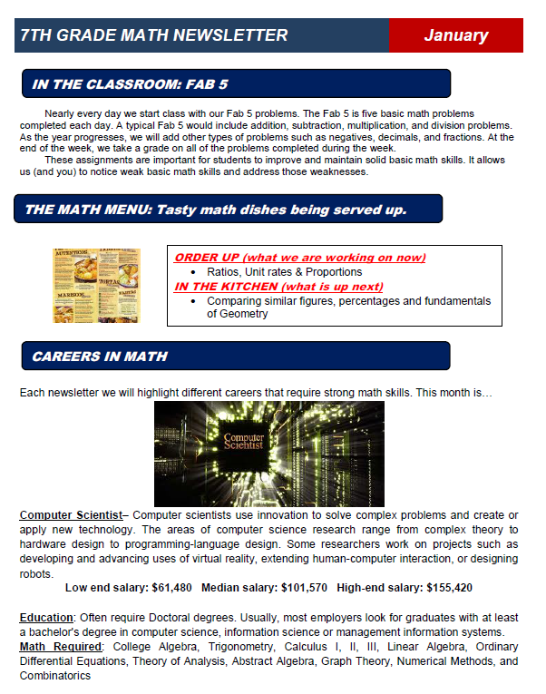
#6 Classroom Activity: In this section of the newsletter we highlight an activity that takes place in the classroom. For example, this newsletter mentions our "Fab 5" which is a basic skills review at the start of each class. In this section we might mention a math program we are using, special projects, or discuss our invention program.
#7 Upcoming Topics: In this section we list what we are currently working on in class and what parents can expect in the next few weeks.
#8 Math Careers: One of our goals is to let parents and students know about the many career options available in mathematics. It seems obvious to us, but many students have no idea about the math needed in different careers. A couple of weeks ago a student told me how he wanted to be an architect but was stunned to find out math was required math.
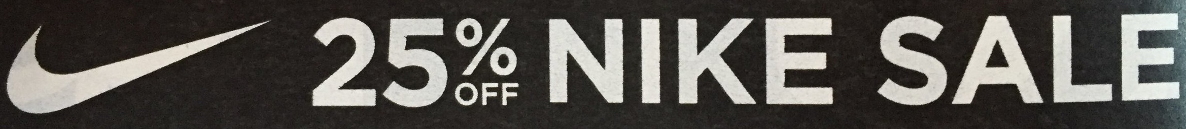
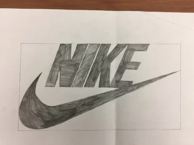
#9 Get to Know a Mathematician: Here we are Highlighting a person that has a career that uses math. We like to focus on interesting jobs/people that are unique. In this newsletter we focused on Tinker Hatfield the person that worked on designing Air Jordan shoes. We make a conscious effort to have an equal amount of men and women.
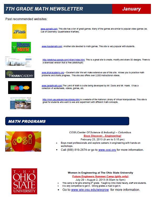
#10 Websites of the Month/Quarter: We feature two or three sites that we feel could be helpful and sometimes interesting. In theory parents and students can use these sites for extra practice or assistance.
#11 Past Websites of the Month/Quarter: Instead of deleting our past website selections we keep them as a running list. As the school year progresses this turns into a nice collection of resources for the student, parent and even teacher.
#12 Math Programs: Our school is located just 30 minutes outside of Columbus, Ohio and just 45 minutes from The Ohio State University. This location allows us to have access to a variety of math programs.
In each newsletter we try to promote local Science, Tech, Engineering, and Math (STEM) programs. This is information that most parents are not aware of. By listing these programs many of our families are able to find items that interest their kids.
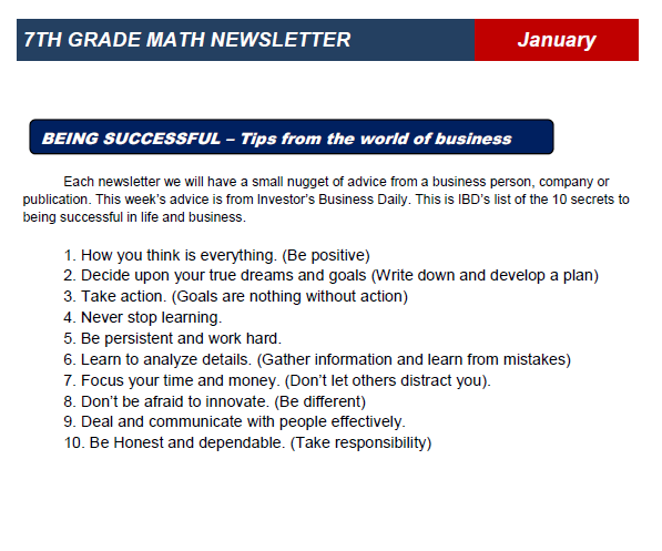
#13 Tips on Being successful: Finally we include some words of wisdom from top business leaders. The theme of this section usually focuses on work ethic, goals, and perseverance.
Todd Hawk is a middle school math teacher and the Founder of the Land of Math LLC (www.landofmath.com). You can reach him at landofmath2@gmail.com or follow him on twitter: @landofmath2.